A journey
into exclusivity
Indiana is an exclusive travel agency that redefines the way luxury is understood. It doesn’t design itineraries, but rather experiences carefully crafted with sensitivity, discernment, and calm.
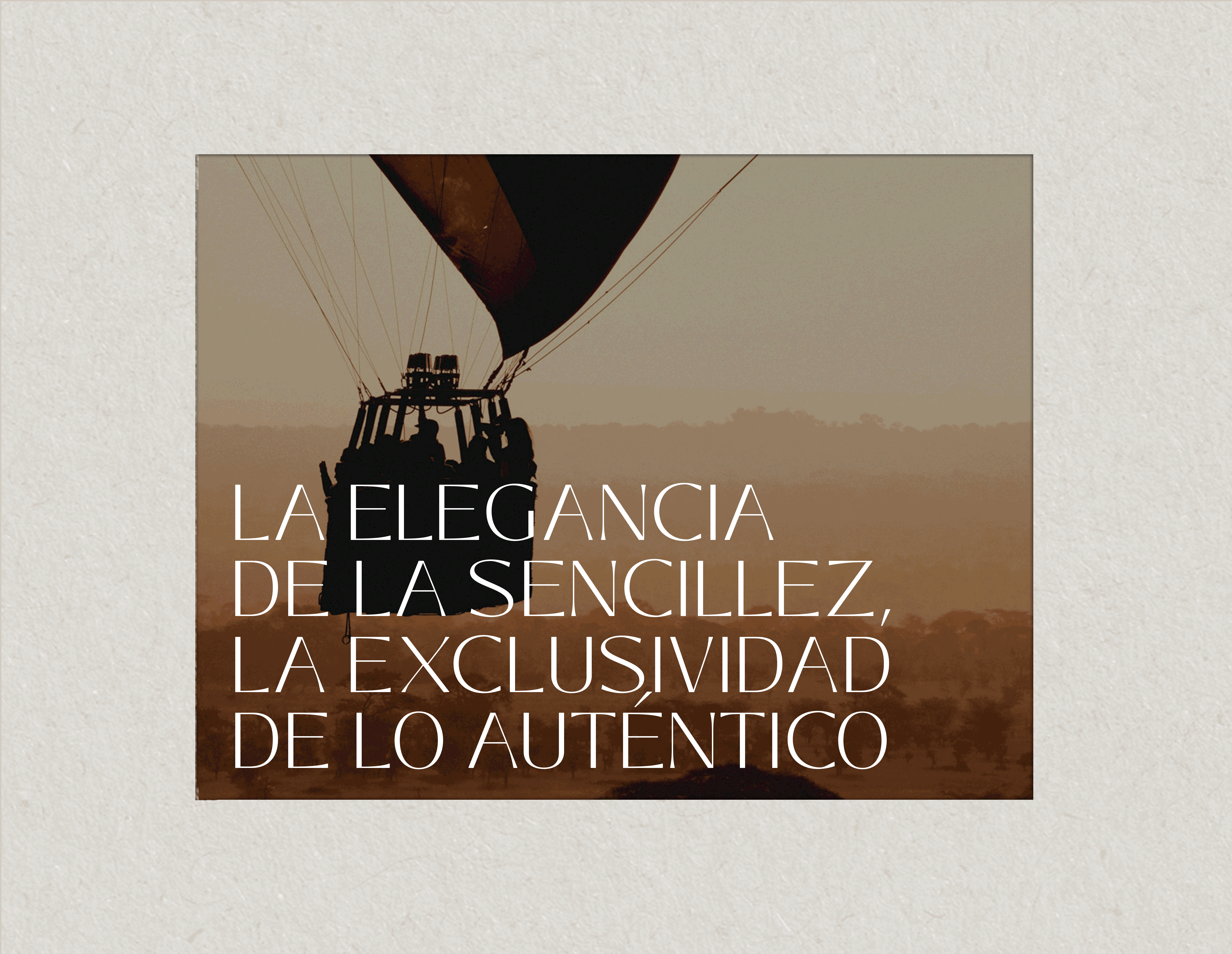
Its proposal stems from a clear vision: that every journey be an opportunity for transformation — a space where the authentic, the local, and the essential become true value.
The project was developed from a conceptual challenge: to translate the emotion of travel into a solid, coherent, and distinctive brand identity. The brand needed to communicate exclusivity without ostentation, sophistication without artifice, and depth without excess.
The result is a visual and verbal universe that combines elegance, balance, and warmth — conveying that true luxury lies not in what is seen, but in what is felt and endures. From naming to tone of voice, Indiana positions itself as a brand that invites you to travel with purpose, where every detail has meaning and every experience is designed to leave an emotional and lasting impression.
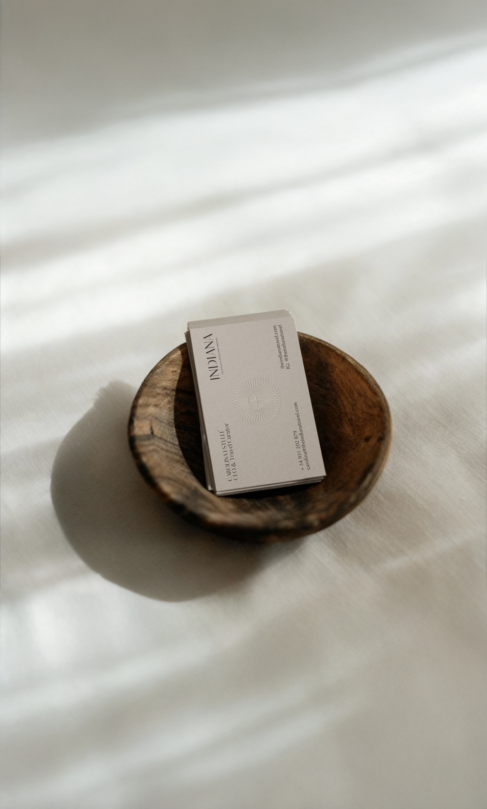
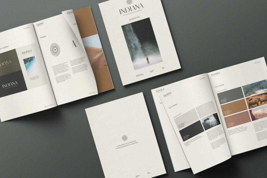
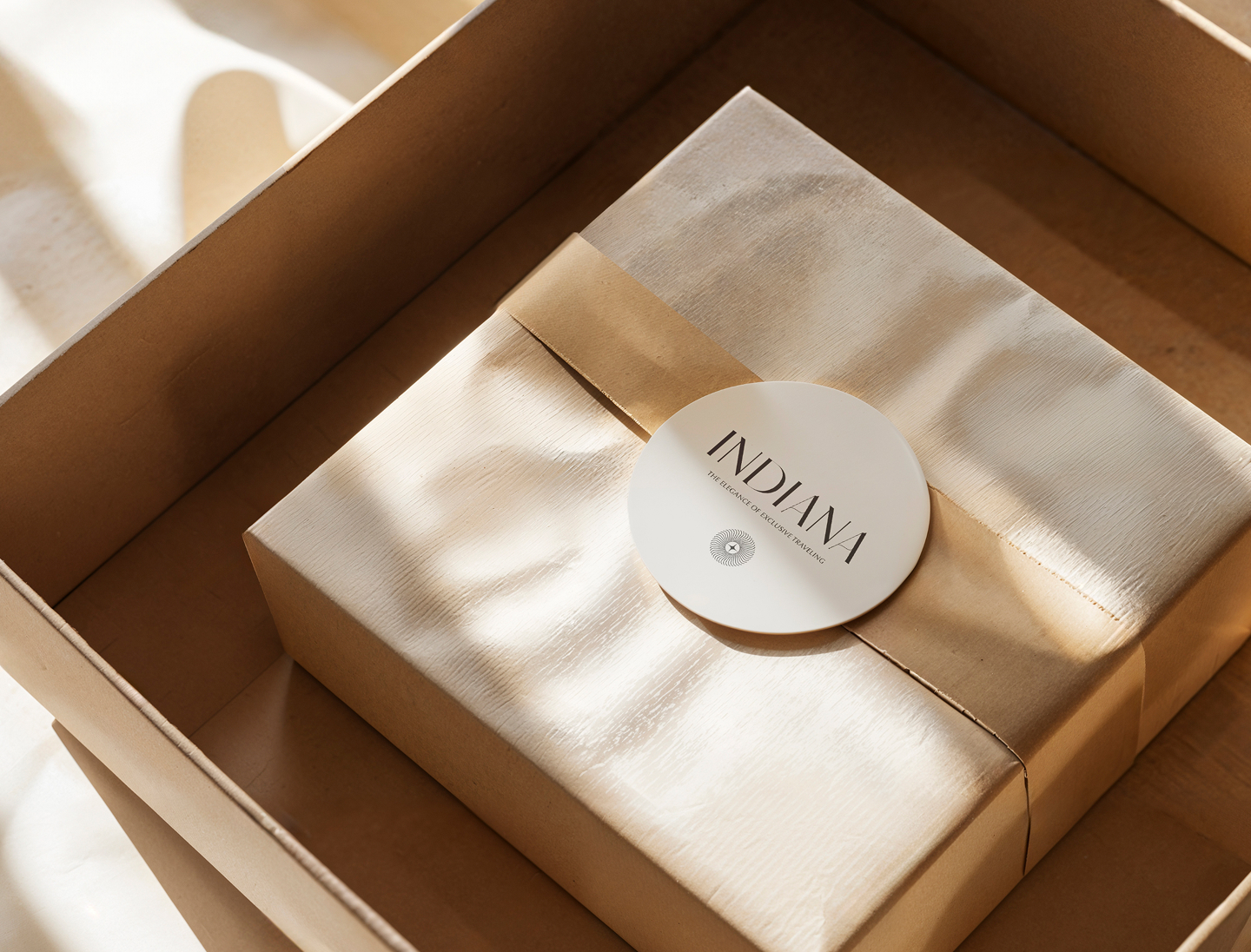
Branding
The branding challenge was to capture Indiana’s invisible essence — that elegance which is not imposed but felt. We built a visual universe that breathes calm, balance, and depth.
The warm palette evokes sun-drenched distant lands; the natural textures recall the tranquility of craftsmanship; and the typography, with its subtle strokes, speaks of the quiet luxury that accompanies those who travel unhurried. The result is a brand that moves between exclusivity and emotion, between the tangible and the spiritual — an invitation to be carried away by the beauty of authenticity.
Storytelling
Logotipo
The Indiana logo was born from the pursuit of balance between elegance and simplicity — concepts that define the brand’s essence and its understanding of luxury.
The main symbol, the sun, serves as both visual and conceptual axis: it represents light, origin, and journey, evoking the spirit of the traveler who seeks authenticity and is guided by inner clarity. Its circular form conveys harmony, continuity, and a sense of calm that reinforces the idea of a conscious, transformative journey.
The typography, carefully refined, gives the identity its distinctive character. Every adjustment in stroke, spacing, and proportion responds to a specific goal: to provide visual balance, legibility, and personality without relying on artifice. The result is a logotype that combines technical precision and aesthetic sensitivity, expressing the brand’s natural elegance.
Together, symbol and word build a luminous, timeless, and coherent identity aligned with Indiana’s visual universe. The logo does more than identify the brand — it encapsulates its promise: to transform luxury into an emotional and conscious experience, where every element holds purpose and meaning.