Renew your skin,
redefine your essence
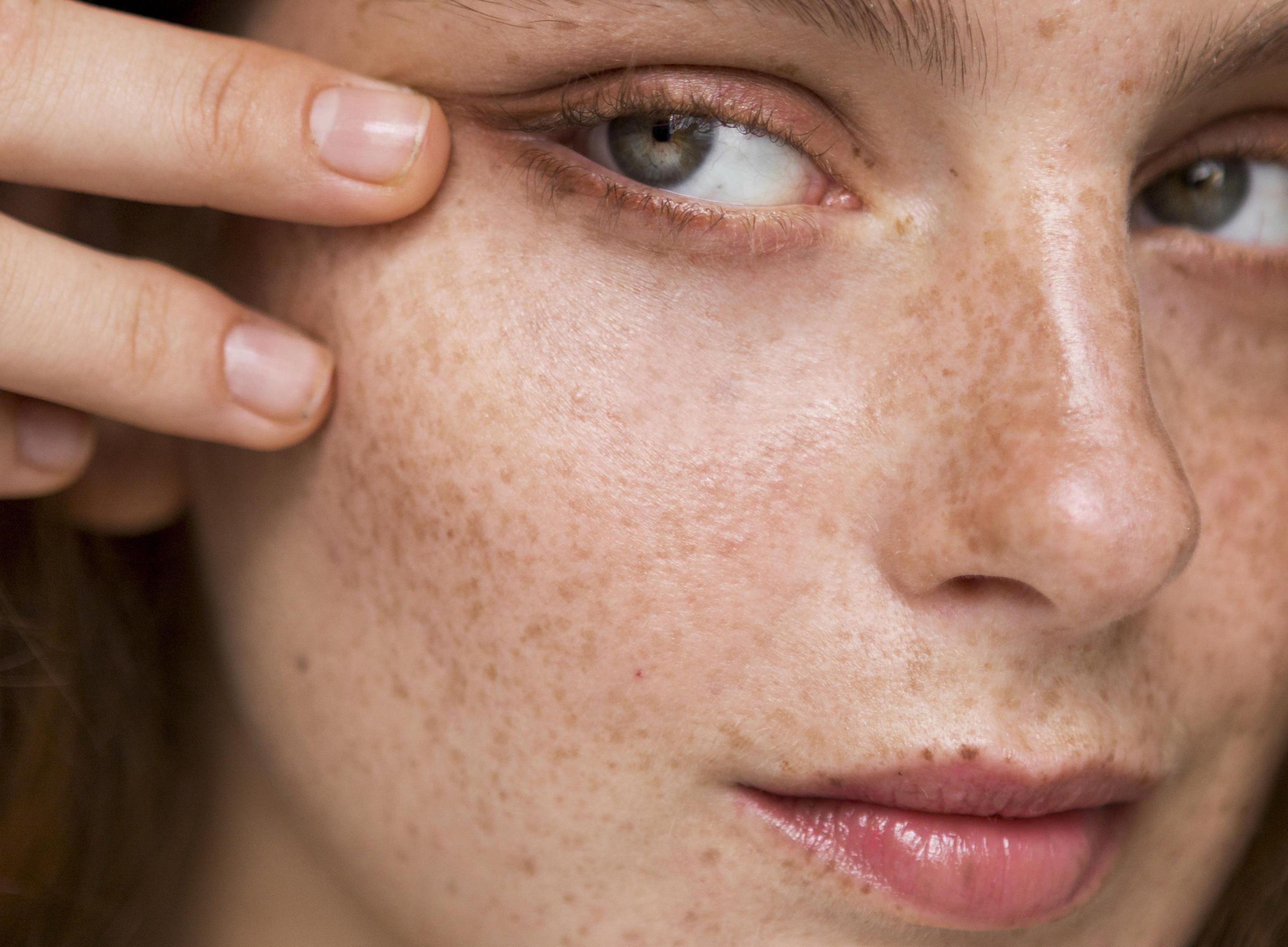
Axovital by Dermofarm is a dermatological brand committed to the well-being of its consumers’ skin. Its formulas, enriched with high-quality ingredients, nourish, hydrate and stimulate cell regeneration, providing more luminous and youthful skin. To strengthen its market presence, Axovital needed to renew its image and reposition itself within its category. The goal was to differentiate itself and consolidate itself in the premium segment of the sector. To achieve this, we redefined its visual identity and brand narrative, creating a fresher proposal aligned with its new aspirations.
Research
To ensure that the brand was positioned in the highest segment of cosmetics, we started with a strategic analysis of the sector. We studied the visual codes both at the micro level, focusing on specific design details, and at the macro level, analyzing global trends and market evolution. We defined the unique character of the brand, ensuring that it reflected freshness, innovation and quality. We identified the key trends to follow, with the aim of building a differentiating and relevant identity within the premium sector.
With this solid foundation, we developed a coherent visual language aligned with the brand’s values.
Logo
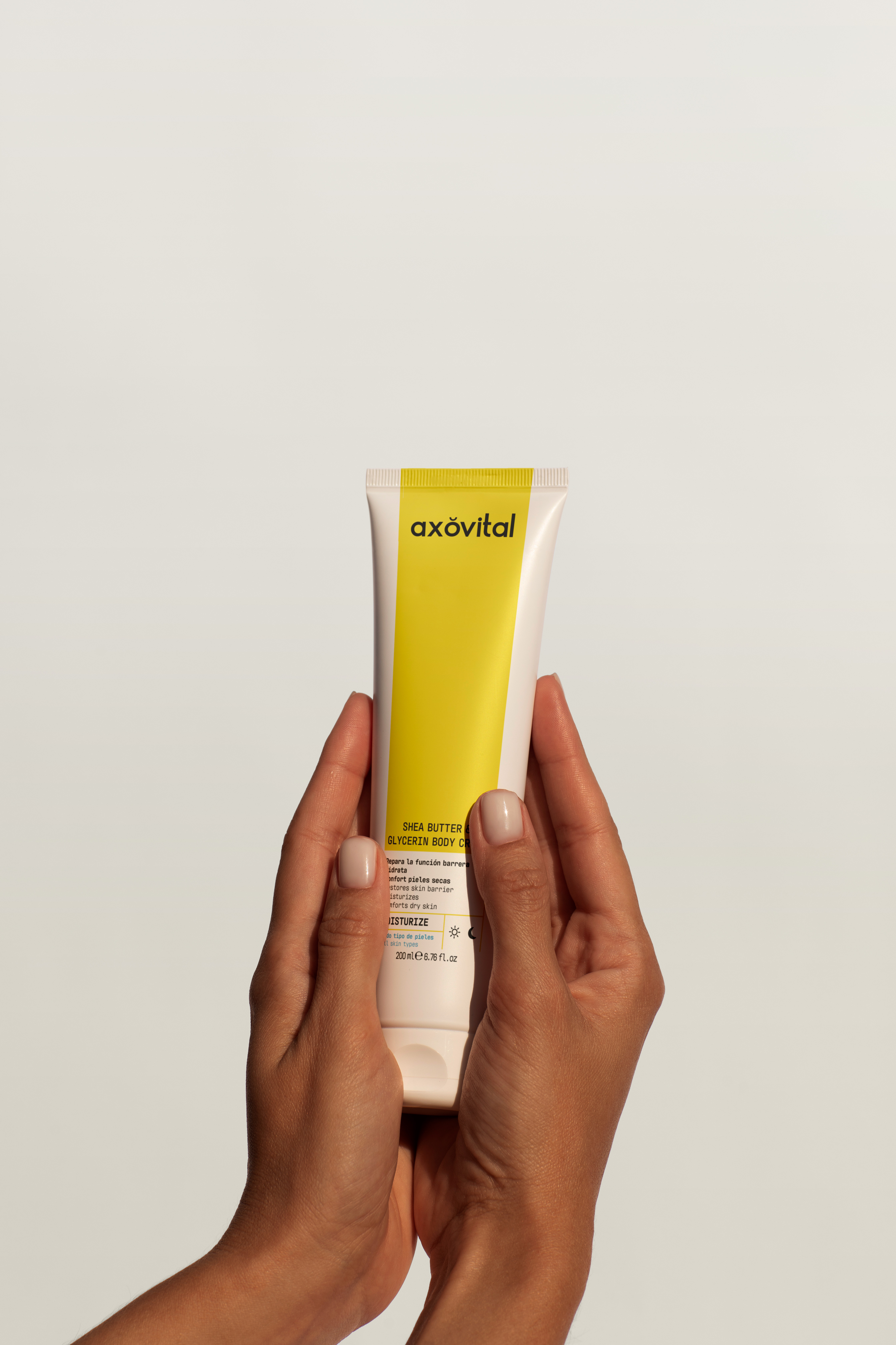
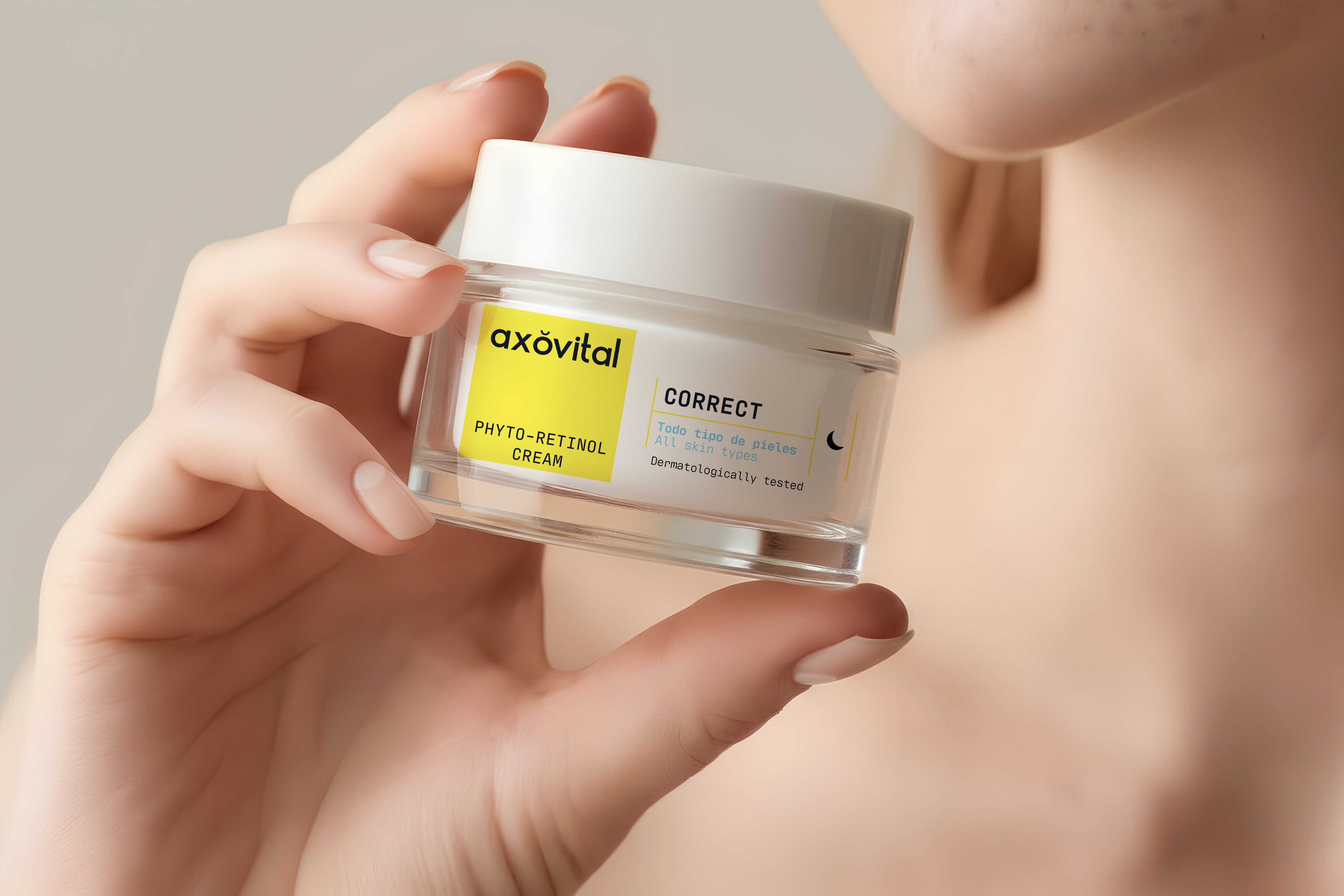
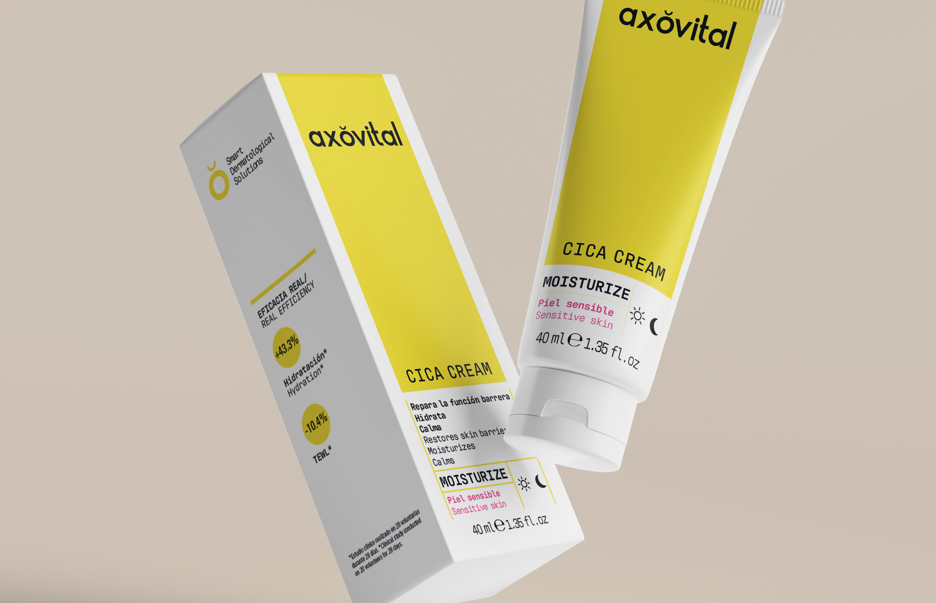
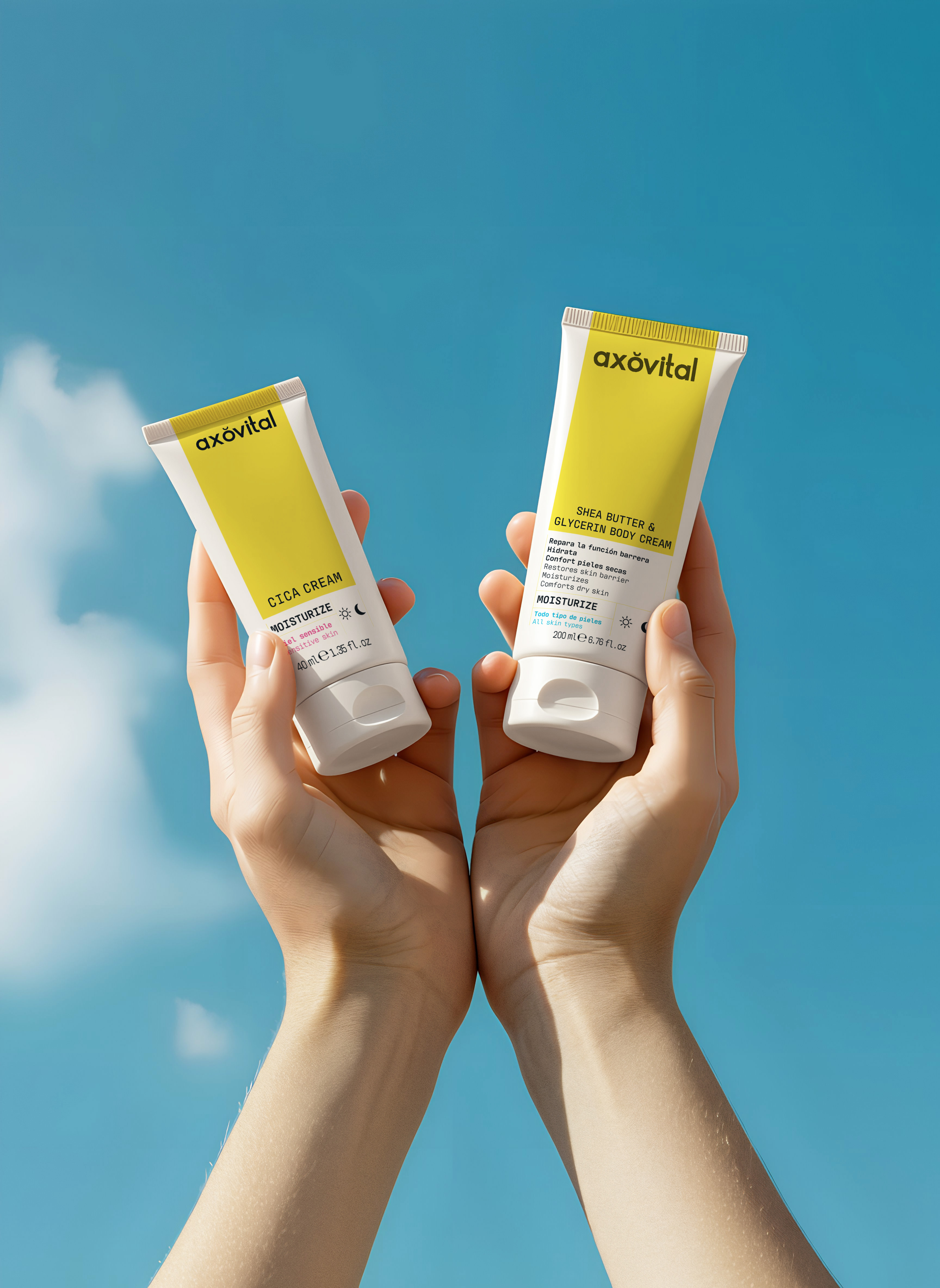
The Axovital logo conveys a sense of modernity, softness and sophistication, aligned with the cosmetic and skin care sector. We use a lowercase typography, with rounded and soft shapes, generating a friendly, accessible and contemporary aesthetic. This reinforces the idea of a close, reliable and wellness-oriented brand focused on self-care. The floating accent above the “O” symbolizes molecules, suggesting a connection with science, innovation and the effectiveness of skin care products. The yellow tone used in the logo conveys warmth, luminosity and vitality, evoking the brightness and health of the skin. In addition, it provides a nuance of exclusivity and optimism, differentiating itself from other cosmetic brands that usually opt for colder or neutral colors.
Storytelling
Axovital is the result of years of research, where biotechnology and dermatology merge to develop treatments that make a difference. We do not seek empty promises, but real, proven and scientifically backed results. We believe in the power of innovation to transform the skin and in the commitment to offer safe, effective and dermatologically tested products.
The brand narrative reflects this essence: clarity, precision and a clean design that speaks of trust and effectiveness. The yellow color evokes the energy and light that the skin needs to stay healthy, while the simplicity of our design conveys our philosophy: effectiveness without complications, science at the service of beauty.
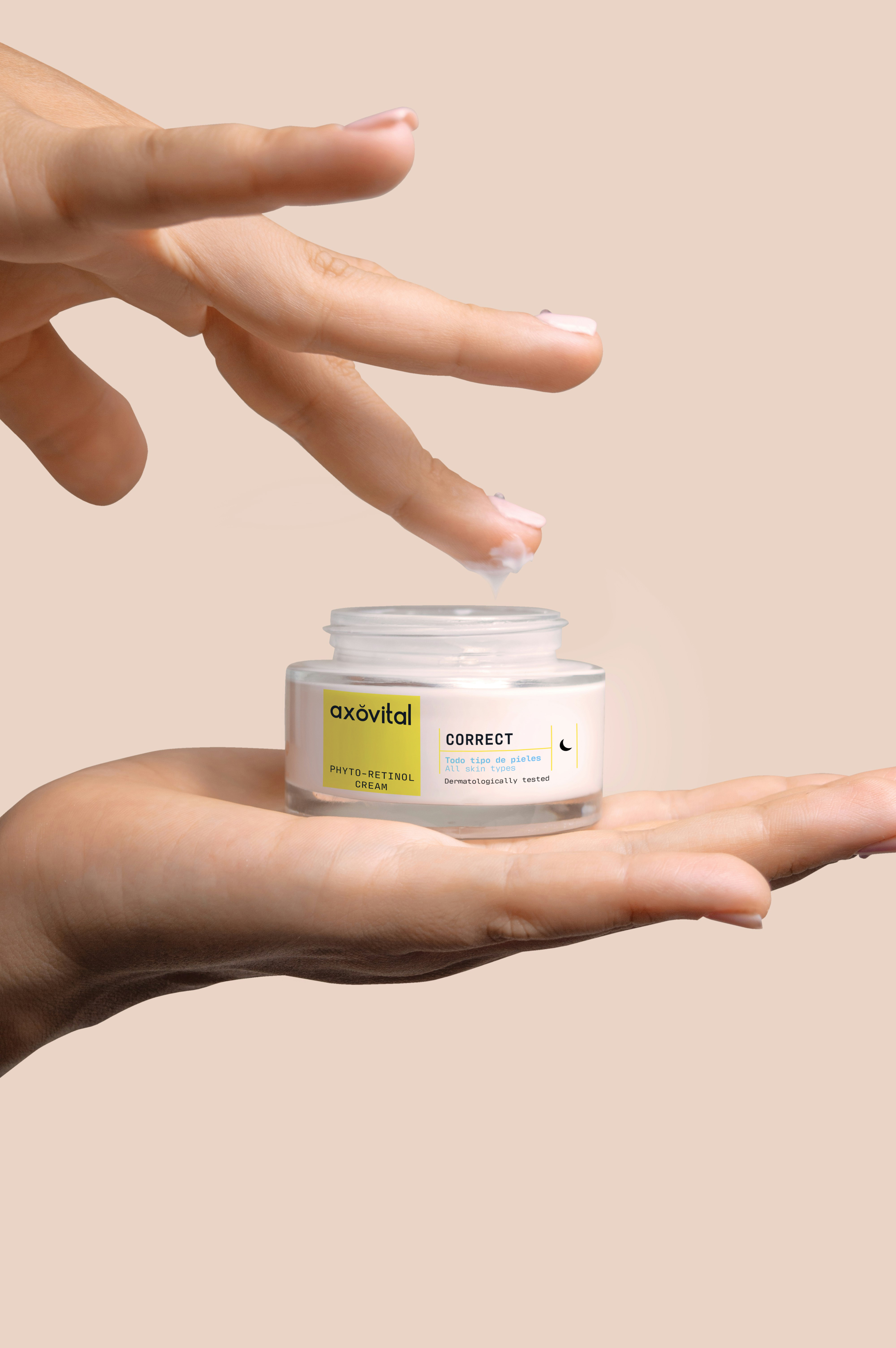
Packaging
The design of Axovital’s packaging reflects a perfect combination of science, innovation and clarity, key elements that reinforce its positioning within skin care. Its minimalist and clean aesthetic conveys a sense of trust and efficacy, allowing the product to speak for itself with a clear and sophisticated visual identity. The color palette is based on a pure white, which evokes cleanliness, dermatology and advanced technology, combined with a vibrant yellow, which symbolizes energy, vitality and light, essential elements in the skin regeneration process. This chromatic combination reinforces the concept of an innovative, scientific and effective brand. The use of simple and modern typographies reinforces the clarity and transparency of the product, ensuring that the information is accessible and easy to read. The face has a functional approach, highlighting the key benefits with well-defined visual hierarchies. Elements such as pictograms and color blocks help to differentiate the product lines and guide the user in choosing the right treatment for their skin. In addition, the design incorporates visual codes typical of scientific cosmetics, with an orderly and balanced arrangement of elements, which reinforces the perception of a reliable brand supported by dermatological research.